Client:
NUS University of Singapore is ranked consistently as one of the World's Top Universities.
Project & Taget Audience:
I was given the opportunity to design an informative print brochure targeted to students at NUS university of Singapore.
Outcome:
In this project I have demonstrated my Page Layout Skills, Content Structure (Information Architecture), Image processing Techniques, use of Strong Colours that gives a lively Aesthetic feel which appeals to the younger aspiring students at NUS University of Singapore.
Design Tools: Adobe Photoshop, illustrator & Indesign.
Research Analysis & Objective
- Design Challenges - Identify User needs, feedback and comments from Play store/App store
- Requirement gathering, what is the current WU app strength and weaknesses, is there any gaps in their offerings and strategy?
- Understand current Stakeholder expectation, external market landscape and learn from their real world behaviour/interaction with app
- Understand business goals and stakeholder needs
Objective
- Optimize services & increase user engagement & conversions
- Synthesize research finding into design insights for the app redesign
- Increase memorability of WU App
- Design User Flow
- Create One-Stop App, covers all aspects of user feedbacks and clearly supports what services users would like to see and access when using the app for remittance.
- 24/7 customer support for peace of mind to end users
User Research, Target Audience & Demographics
- Blue-Collar Workers, Expatriates, SME's, Consumers Remitting foreign currency, Consumers receiving money.
Challenges/Issues
- Low downloads and rating on Appstore
- Users complain of less functionality and services offered
- Current WU App, doesn't support mobile money transfer overseas
- Less Services offered on mobile
Competitor Analysis
- Top 3 Competitors in the current market according to a case study [DataFox. (2017). Top 5 Western Union competitors in the financial services Industry. Available at: https://datafox.com/competitors/western-union]
Redesign Proposal
- Restructured site-map and Information architecture
- Organize, Support Usability and User Flow
- Easy Navigation and presentable elements
Prototype
- Low to High Fidelity Wire frame and Prototype
User Testing & Expected Outcome
- Higher Downloads
- Better Rating
- Revenue Generation
- Conversions
Design Tools: Sketch, Adobe Photoshop, Illustrator & Marvel
*This is strictly an independent self-initiated redesign project, not meant to plagiarize or claim ownership.
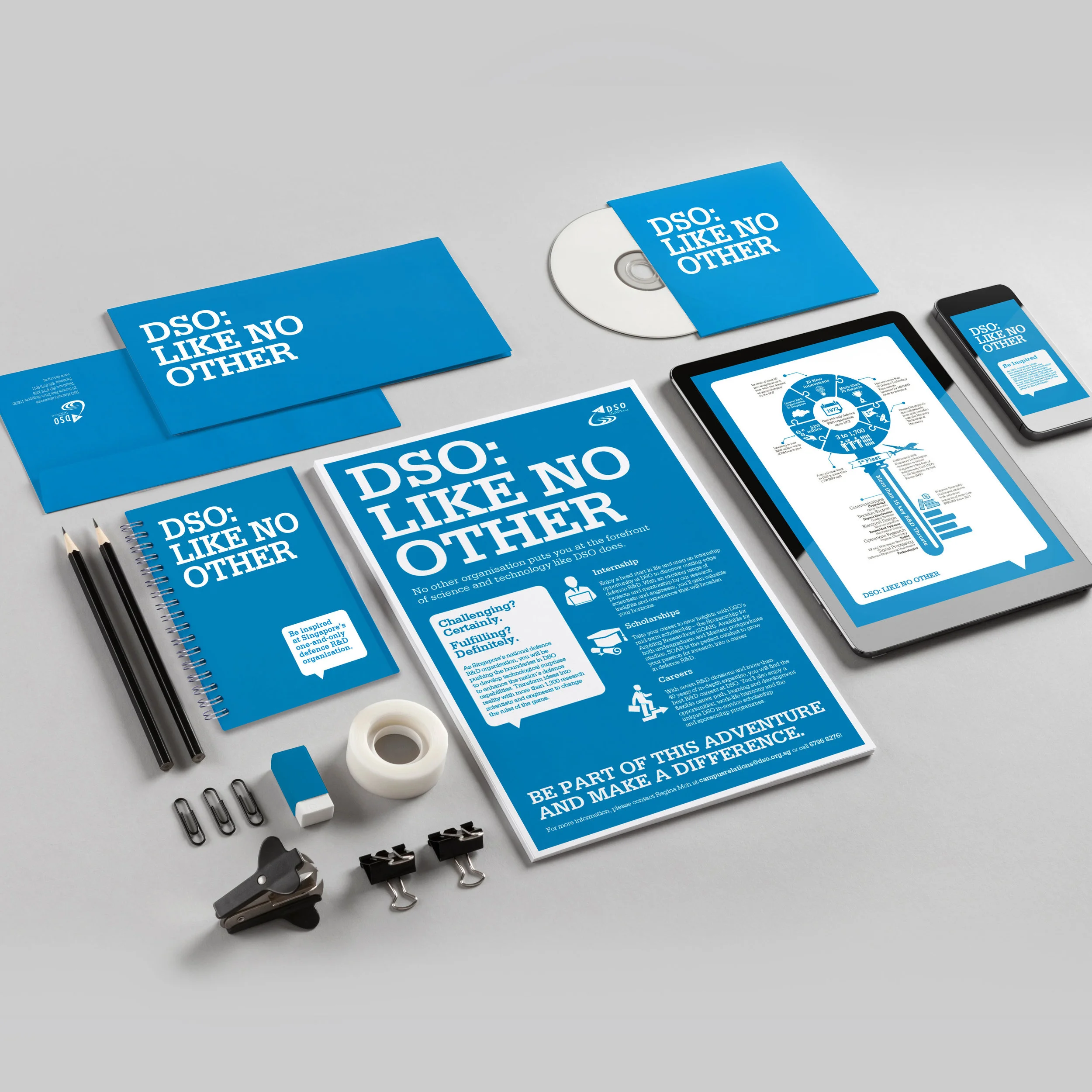
Client:
DSO National Laboratories (DSO) is Singapore's largest defence Research & Development (R&D) organisation.
Project & Audience:
To provide Creative Solution for DSO National Laboratories's Recruitment Campaign in 2015. The Recruitment Campaign was targeted to fresh graduates and employees seeking a career in R&D Industry.
Outcome:
In this project I have kept in mind the existing Brand Identity of DSO National Laboratories and have tailored the creative design according to their visual identity, keeping the colour scheme consistant.
The Design aesthetic of this Campaign includes Page layout, Content Structure (Information Architecture), including the use of Colours Scheme, Typography & Infographics.
Design Tools: Adobe Illustrator, Photoshop & Indesign.
Market Research
According to an article posted by PYMNTS, November 5, 2018 about “Insurance Firms Cozy Up To Wearables And Fitness Tracking Tech Globally”
(Article Source: https://www.pymnts.com/healthcare/2018/insurance-firms-wearables-fitness-trackers-digital-technology/)
“Digital technology and the data that consumers are willing to provide are giving insurance agents a closer look at the day-to-day habits of individuals, with premiums and policies ideally being adjusted to better reflect risks. Among the most promising areas for this new world of insurance is wearables and fitness trackers, a point brought home in Fitbit’s most recent earnings, along with other developments.”
Research Analysis & Objective
Hence with the growing popularity of smartwatches, Apple Watch still drives the wearables market, with usage of Fitbit in the digital technology & the data that consumers are willing to provide on their day-to-day habits of individuals.
Concept & Idea
ManulifeMOVE app is a fitness tracker build to motivate people to lead an active lifestyle hence my concept & idea is to include relevant features/elements related to healthy eating & living (e.g sports, fitness, nearest fitness events/locations). Also to introduce features of various blog articles related a health & lifestyle including fitness & wellness to enhance the existing ManulifeMOVE app.
UX/UI Research & Design
You may find detailed research compilation in the link below:
Manulife App (UI/UX Research & Design)
UI Design Prototype:
Manulife App UI Prototype
Design Tools: Sketch, Adobe Photoshop, Illustrator & Marvel
*This is strictly an independent self-initiated redesign project, not meant to plagiarize or claim ownership.
Client:
NUS University of Singapore is ranked consistently as one of the World's Top Universities.
Project & Taget Audience:
To Design a Freshman Guide (Prospectus) for aspiring students who are looking to get an Admission in NUS University of Singapore to pursue Higher Education in the University.
Outcome:
This project has allowed me to apply & analyse User Experience & Understanding. In beginning of the project I was given a chance to have a short discussing with existing NUS university students on their feedbacks on University Prospectus.
After an in-depth understanding, I gathered all valuable research and validated/consolidated it to provide a creative solutions. I was working closely with the Creative Director & Digital Photographer to host a photoshoot to capture images of real students, their life at NUS University, their environment along with some candid shoots.
All this process was captured and communicated through the Freshman Guide (Prospectus).
Skills:
Page Layout Skills, Content Structure (Information Architecture), Image processing Techniques, use of Strong Colours that gives a lively Aesthetic feel which appeals to the younger aspiring students at NUS University of Singapore.
Design Tools: Adobe Photoshop, After Effects, Illustrator & Indesign.
Client:
The Clinical Imaging Research Centre (CIRC) is a joint venture between National University of Singapore (NUS) & its Singapore's newest national platform for research imaging.
Project & Taget Audience:
Client required promotional materials to introduce MRI Brain Scanner in a positive manner for their Target Audience.
Outcome:
After having an understanding of the product (MRI Brain Scanner), its purpose & functionality. I then brainstormed & gathered inspirations on the use of Colour Psychologically & Design Principles to appropriately Targets the Audience positively.
Skills:
Page Layout Skills, Content Structure (Information Architecture), Image processing Techniques, use of Strong Colours that gives a positive visual appeal.
Design Tools: Adobe Photoshop, Illustrator & Indesign.
Client:
Holmes & Marchant is Global Brand Design Consultancy pioneering a more agile approach to Brand Development. A Packaging design specialists & has picked up a major structure and graphics projects for Unilever's Brands (consumer goods company)
Project & Concept
Unexpected Infusion, Natural Balance & Energy Fusion themes of the product to target different consumer segments in Asia. To introduce ice tea for the youthful & active consumers.
Outcome:
Targeting the active & youthful population who are always on the go. Keeping this in mind I have made a design proposal that suggests a more vibrant appeal to the audience.
I have used a strong & playful colour theme & also applied image manipulation techniques to produce appropriate F&B Packaging Design.
Design Tools: Adobe Photoshop, After Effects & Illustrator.
Client:
Mapletree Logistics Trust (MLT) is a real estate investment trust which invests in logistics warehouses in the Asia-Pacific region. It currently owns a diversified portfolio of warehouses in Singapore, Japan, China, South Korea, Vietnam, Australia, and Hong Kong.
Project & Target Audience
The brief by the client, Mapletree Logistics Trust (MLT) advised to provide a Creative Solutions & to Design their yearly Annual Report 2014/2015. Targeting their Stakeholders looking to invest in their Industry for Business Acquisitions. The concept was to introduce Stability & Positive Growth for the Future in Mapletree Logistics Trust (MLT).
Outcome
After understanding the client requirements, I was working closely with the Creative Director & Project Manager to deliver a successful Annual Report 2014/2015 Publication from Start to Finish.
From conceptualising theme "Building Today, For Tomorrow" to managing client's requirement on signing off for Print Production (liaising with print vendors) and delivering 10,000 Reports consisting of 100 pages.
Skills:
In this project I have demonstrated my Page Layout Skills, Content Structure (Information Architecture), Image processing Techniques, use of Strong Colours & Typography. Also I have showcased leadership & project management skills.
Design Tools: Adobe Photoshop, Indesign, MS word & Excel.
Client:
Eurasia Shipbrokers Pte Ltd a Start-up company, which has a background in Shipping Industry.
Project
This project required me to provide a visual branding solutions for Eurasia Shipbrokers Pte Ltd an Aspiring Shipping Company.
Outcome & Skills:
In this project it was highly important for me to provide my best input as Branding is one of the most important aspects of any business.
My aims was to establish a significant and differentiated presence for Eurasia Shipbrokers Pte Ltd in the market that attracts and retains loyal customers for their business.
concept & Idea
After doing some research on various competitors and their use of Branding Style in the shipping industry, I realised that there has not been match effort taken by various shipping companies in their branding/identity department.
Therefore I decide to create an impactful & in-direct Visual Identity for Eurasia Shipbrokers Pte Ltd.
The logo is cleverly designed to look like a ship's deck. I have explored and played with shapes to symbolise close identity of a ship that serves the purpose of this Visual Identity appropriately.
Design Tools: Adobe Illustrator & Photoshop.
Client:
Cesstech, short for Cleanroom Equipment and System Solution Technology Technology, has been a premium engineering solutions service provider since 1999. They supply high quality technology-related product lines and solutions.
Project
Re-branding of yearly Corporate Calendar 2016. To providing a creative solution to Cesstech, a client from the Engineering & technology Industry.
Outcome:
In this project I have demonstrated my Page Layout Skills, Content Structure (Information Architecture), Image processing Techniques, use of Strong Colours & Typography.
Managed project from start to finish, including leasing with print vendors for print production and delivery of 200 calendar copies.
Design Tools: Adobe Photoshop & Indesign.
Client:
NUS University of Singapore is ranked consistently as one of the World's Top Universities.
Project & Taget Audience:
To Design NUS Financial Aid (Prospectus) for aspiring students who are looking to get financial help in NUS University of Singapore to pursue Higher Education in the University.
Outcome:
This project has allowed me to apply & analyse User Experience Research & Understanding. In beginning of the project I was given a chance to have a short discussing with existing NUS university students on their feedbacks on University Prospectus.
After an in-depth understanding, I gathered all valuable research and consolidated it to provide a creative solutions. I was working closely with the Creative Director & Digital Photographer to organize a photoshoot to capture images of real students, their life at NUS University, their environment along with some live on-site shoots.
All this process was captured and communicated through the NUS Financial Aid (Prospectus).
Skills:
Page Layout Skills, Content Structure (Information Architecture), Image processing Techniques, use of Strong Colours that gives a lively Aesthetic feel which appeals to the younger aspiring students at NUS University of Singapore.
Design Tools: Adobe Photoshop, Illustrator & Indesign.
Client:
Tuas Power provides electricity solutions to commercial and industrial users from a wide spectrum of industries through its subsidiary Tuas Power Supply (TPS), a leading electricity retailer that is well known for its professional, reliable and innovative services in Singapore.
Project & Taget Audience:
To provide creative solutions to design a Sustainability Report for Tuas Power. The Sustainability Report is intended to explain the environmental and social issues associated with our business and the actions we are taking to manage and improve our performance in these areas.
Outcome:
After an in-depth understanding on the client requirement, I have gathered all valuable research and consolidated it to provide a creative solutions. I was working closely with the Creative Director & Digital Photographer to host a photoshoot and to capture activities of real engineers on-site working.
All this process was captured and communicated through the Tuas Power Sustainability Report.
Skills:
Page Layout Skills, Content Structure (Information Architecture), Image processing Techniques, use of Strong Colours, inforgraphic (icons) & Typography.
Design Tools: Adobe Photoshop, Illustrator & Indesign.
Client:
Obikwa is a South African Winery specializing in classic South African grape varieties such as Sauvignon Blanc, Cabernet Sauvignon, Pinotage & Chenin Blanc.
Project & Taget Audience:
Obikwa Wines has planned launch a new wine product to target consumers specifically to South African market.
Outcome:
After having an understanding of the product that expresses ethnic charm & has characteristics with a distinctive South African heritage purpose & functionality.
I have brainstormed & gathered research about the Brand & to explore their Style & Visual Identity. After which I also applied and designed the Packaging according to the good sense for Green values of Obikwa's values adhering to Eco-friendly practices in moving ahead to Minimise Carbon Footprint Globally.
Skills:
I had the opportunity to explore and to showcase my Illustrating abilities which further was improvised and used in the Packaging Labelling Design with Image manipulation, Typography & Studio Setting Product Photography.
Design Tools: Adobe Photoshop & Illustrator
Client:
QAF Limited, a leading multi-industry food company with core businesses in Bakery, Primary Production & Trading and Logistics. Also well known for their Gardenia speciality bread locally.
Project & Target Audience
With a growing & strategic network of Operations & Alliances across the Asia-Pacific region including Singapore, Malaysia, the Philippines, Australia & China.
The Clients brief was to receive a Creative Solutions for their yearly Annual Report 2014/2015. Targeting their Stakeholders looking to invest in the F&B Industry for Business Ventures in the Asia-Pacific region.
The concept was to introduce value in the form of quality for consumers & stakeholders. Hence the idea "Creating Value" developed.
Outcome
After understanding the client requirements, I was working closely with the Creative Director & Project Manager to deliver a successful Annual Report 2014/2015 Publication from Start to Finish.
From conceptualising theme "Creating Value" to managing client's requirement on signing off for Print Production (liaising with print vendors) and delivering 10,000 Reports consisting of 100 pages.
Skills:
In this project I have demonstrated my Page Layout Skills, Content Structure (Information Architecture), Image processing Techniques, use of Strong Colours & Typography. Also I have showcased leadership & project management skills.
Design Tools: Adobe Photoshop, Indesign & MS word.
Singapore Post (SingPost) Annual Report 2015/16 Financial Report Proposal. The concept was to show SingPost will be adopting more Technology in their services going forward.
Client:
SingPost is pioneering and leading in eCommerce logistics as well as providing innovative mail and logistics solutions in Singapore and the Asia Pacific, with operations in 15 countries.
Project & Target Audience
The brief by the client, SingPost advised to provide a Creative Solutions & to Design their yearly Annual Report 2014/2015. Targeting their Stakeholders looking to invest in their Industry for Business Acquisitions & Ventures.
The concept was to show SingPost has adopted a more Technological approach in their services & going forward & introducing Digitalisation through Technologies. Hence "Transform, Evolve & Change".
Outcome
Upon understanding the client requirements, I was working closely with the Creative Director to create & conceptualise a Proposal for Singpost Annual Report 2015/2016.
Skills:
This project demonstrates my ability to conceptualise & copywriting Themes & to execute my idea in form of presenting a creative proposal, including my Page Layout Skills, Image processing Techniques & use of Typography.
Design Tools: Adobe Photoshop & Indesign.
Client:
The Body Shop is a global manufacturer and retailer of naturally inspired, ethically produced beauty and cosmetics products.
Project & Taget Audience:
As the tittle suggests, its a packaging design for a existing product at BodyShop. Objective is to Re-design a packaging after analysing and keeping in mind the company's Brand, Visual Style, Target Audience & Background.
The Body Shop main target audience is 20-55 year old women, also according to my research The Body Shop products are animal cruelty free and only use 100% natural ingredients. They are always trying to use recycled materials for product packaging that is 100% recyclable.
Outcome:
Getting an understanding of the product and the users's characteristics and needs, I brainstormed & gathered research about the Brand & to explore their Style & Visual Identity.
After which I also applied and designed the product using recycled materials for product packaging that is 100% recyclable.
Skills:
Applying an Eco-friendly approach to my design has allowed me to think in a sustainable way. That not only deals with Design Aesthetics but also selecting the Materials in terms of Manufacturing cost for Large Scale Production.
Ability to think in diverse spectrum from conceptual to producing packaging high-level mock-ups. Hence the ability to also do product photography in a studio setting.
Design Tools: Adobe Photoshop & Illustrator
*This is strictly an independent self-initiated redesign project, not meant to plagiarize or claim ownership.
Client: Enavose Life Science Research is (R&D) Company thats produces cosmetics, skincare & nutricosmeceuticals products in most natural but enduring ways in Singapore.
Projects & Taget Audience:
To produce effective campaigns targeting young women in Singapore. To advocate wellness and health as the source of naturally beautiful skin.
Outcome & Skills:
Working closely with the Marketing team to create and stylise Visual Brand Identity & the application of it to various marketing materials online & in print.
Handled Social Media Marketing, Packaging, Creating Electronic Direct Mailers, Website Management, Product photoshoot in Studio Setting & Store Visual Merchandising for Product Launch.
Design Tools: Adobe Photoshop, Illustrator & HTML Dreamweaver.
Client:
Greendot started in 2011 by an aspiring entreprenuar with the goal to advocate and intiate making healthy meat-free meals choices.
Project & Objective
GreenDot has recently expanded their outlets for consumers who prefer choosing healthier meals. Its growing rapidly and gainging acceptance by Singaporeans.
Therefore the objective for this project was to create a Website Interface Design Proposal for the client looking to have a more creative and astheticaly fun looking website.
Outcome & Skills
My task was to create a vibrant website interface design that can be used as an informative purpose. I showcased my illustrative ability to communicate the idea/purpose distinctively.
A purely design based website, there is no developing/coding invovled.
Design Tools: Adobe Photoshop & Illustrator
Client
Mandarin Gallery, a gem in the heart of Singapore's shopping belt at Orchard Road, it is home to some of the biggest international brands globally.
Project & Target Audience
Clients brief was to create a effective marketing campaign that consist of Re-branding of their visual identity keeping the oriental essence/presence. Their aim is to target the young and affluent customers.
Objective
The objective of this campaign is to Increase customers interactions digitally & to bring in more customers to receive an enjoyable shopping experience online & In-sore.
Outcome & Skills
Theme & Style is a mixture of modern & oriental combination aesthetics overall. Strong use of imagery and calligraphy brush strokes to enhance the oriental look & feel.
The proposed visual branding has been applied to various application such as, Mobile interface Design, Website, Advertising Posters & Product Catalogues.
Design Tools: Sketch, Adobe Photoshop & Illustrator
Project & Objective
Anatalis, Europe's leading distributor of paper, packaging solutions and visual communication products for professionals.
This project is a self initiated to participate in the Conqueror Design Contest 2011 for Anatalis.
The objective is to promote a new range of paper collection with a twist in creativity with various art execution to build a theme that suits the new paper collection range as suggested in the contest brief.
Outcome & Skills
My Design Concept & Execution has been selected & featured for the Conqueror Design Contest 2011 by Anatalis as 2nd runner up for participation.
The Concept & Idea is inspired by a combination of modern & traditional (old & new) outlook. I did this by combining the 12 types zodiac signs in Astrology, by selecting 12 types of paper samples available in the collections at Antalis. Hence to promote a new range of paper collection through the 12 types of zodiacs signs in Astrology.
The proposed theme visuals, icons & logo branding has been applied to various print materials, such as promotional posters & paper sample catalogues.
Design Tools: Adobe Illustrator & Indesign.
Proposal for Fashion Event, Merchandise Design and Webdesign
Project & Objective
The objective is to create an Event Campaign for existing fashion brand H&M based on an intensive market research + proposing a creative campaign based on case study.
Outcome & Skills
The idea proposed is to build a Event Campaign through an in-depth Research & Analysis of existing fashion brand's Target Audience Study, Competitor Analysis, Market Propositions Research & Brand Analysis/development.
My concept & execution is inspired by H&M's contemporary and edgy aesthetic outlook. I have explored the use of typography & Imagery to create a consistent style which has been applied to various materials (Event Website, Catalogues/Brochures, Invitations & Merchandises).
Design Tools: Adobe Photoshop, Flash, HTML Dreamweaver & Indesign.
*This is strictly an independent self-initiated redesign project, not meant to plagiarize or claim ownership.
Product:
Botanicaire is a leading-edge air purifier that integrates Mother Nature's intrinsic power, advanced technology for your homes, offices and living spaces. The product specialises in plants & microbe to remove contaminants in the living environment.
Project & Objective
To provide creative solutions based on Data Research Analysis, about User Experience, Product Functionality & Competitors Analysis.
Research
Through this project I had the opportunity to understand user's needs and requirement, challenges in order to create an effective Advertising Campaign that enables/advocate users to switch to Botanicair that purifies air in the surrounding naturally rather then the use of harmful room-freshener.
Outcome & Skills
In this Advertising Campaign, I have used my User Experience knowledge to understand & survey Targeted Audience to receive insights on a more Human-Centere Approach on the reasons for using harmful room fresheners to remove odour in the living environment.
I have consolidated all the research study in a report to describe my ideology and thinking process while planning this advertising campaign.
The skills demonstrated are the ability to validate through brainstorming & discussions in order to gather user research findings, copywriting for advertising campaign, providing information architecture of content in product catalogue.
Also my ability to provide a creative solution based on User Experience Research. Maintaining a consistent visual identity & stylisation throughout campaign.
Research Tools: Survey monkey, MS Word & Powerpoint.
Design Tools: Adobe Photoshop & Illustrator, Indesign
Project & Objective
This project is a self initiated project, produced to demonstrates various human psychology behaviours patterns.
Outcome & Skills
A university project that allowed me to think out-of the box while conceptualising for this project.
This project also showcase my ability to execute an inspired idea/concept. I have explored the use of Typography, Image Processing, Illustrations & Photography throughout the this project.
Design Tools: Adobe Photoshop, illustrator, Indeisgn
Client & Project:
A freelance client looking to celebrate their precious day. I was working closely with the client to provide my creative in-puts & solution to design a wedding invitation & wedding favours for their guest.
Outcome & Skills:
I have successfully managed to design a create a simple Eco-friedly Packaging Design according to the wedding theme planned & managed project budget with a in-expensive approach. Also liaised with print vendors to coordinate print production process.
Design Tools: Adobe Photoshop & Illustrator